As I am building my app, I have encountered several design setbacks I would like to address. I hope that these oddities will be fixed in the future.
1. Adding text
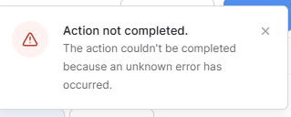
When typing out text, I have discovered that when I accidentally or purposefully type a \, everything that has been typed in the box is suddenly completely erased. This has made me cry on several occasions. The following error message is what appears when typing a \. Typing a / does nothing but inserts a / into your text. ![]()
Also, sometimes hitting backspace erases everything too. ![]()
2. Text Input (for forms)
When adding single-line text placeholders, the text is faded and looks nice. However, when adding a multiline placeholder, the text does not follow the same color scheme/theme. See images below.


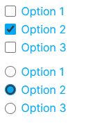
3. Radio buttons and check boxes
I had previously posted on this before, but I figured I would include it in this post. The check boxes and radio button borders cannot be changed and do not match the set designs. I have tested everything in Chrome, Firefox, and Edge. Previous post can be found here: Can you change the color of radio buttons?
4. Markdown
I have noticed that a lot of typical markdown does not work. I am hoping the markdown commands will expand in the future. In the mean time, I have noticed a few oddities.
Markdown links become smaller than the designated text size.
![]()
When adding a bulleted list, the text becomes smaller and does not follow the designated color scheme.
5. The “Show More” button on the repeat element
The button is too close to the element and cannot be edited?

It would also be nice if we could hide the “show more” button and only show…say 10 repetitions.
That’s all for now?
Bonus feature request:
Ability to add an anchor link to scroll to a designated part of the page. I tested with an “iframe element” but I couldn’t get it to work, unfortunately.