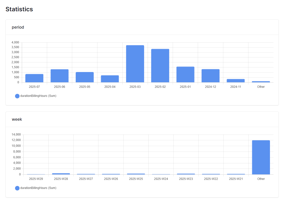
The “other” section is totally messing up the scale, so other periods are not really visible anymore.
Hey @chriscypurs, I’ll check this with the team ![]()
Hey @chriscypurs,
We had an internal discussion on this and we’re thinking about introducing an option to exclude the “Other” computation. Would love to hear your thoughts on that!
In the meantime, a workaround is to create a new view with only the 10 fields you’d like to visualize in the dashboard. This will prevent the “Other” bar from appearing (it only shows up when there are more than 10 fields in the view). Hope it helps!
Hey Olga, it would be also nice to have more than 10 data points and set a custom limit like max 15 or max 20. There is plenty of space to show more bars in the chart.