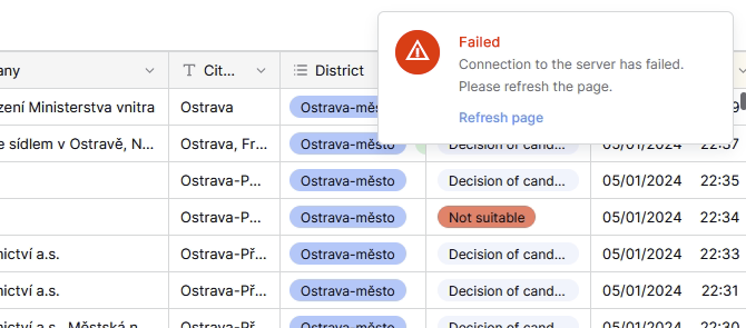
I have feedback from few users of our baserow workflow - they often overlook the “connection failed” pop-up.
Would you mind to make it more visible? F.e. like this (the attention icon and “Failed” text in more aggressive red):
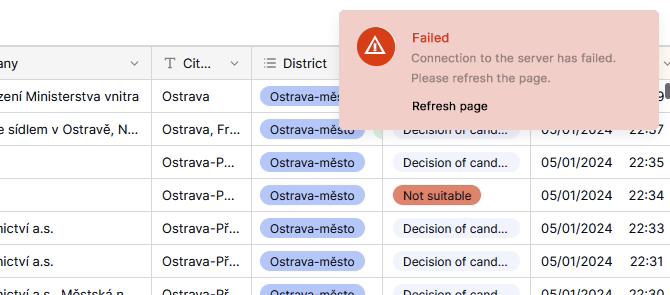
or like this:
I have feedback from few users of our baserow workflow - they often overlook the “connection failed” pop-up.
Would you mind to make it more visible? F.e. like this (the attention icon and “Failed” text in more aggressive red):
or like this:
Hello @marcus, sure, let me discuss it with the team. ![]()
Hey @marcus, we’re going to leave this pop-up as it is for now because other users have provided feedback that it’s too bright for them. Having a color that is neither too bright nor too light is the best alternative for everyone. ![]()