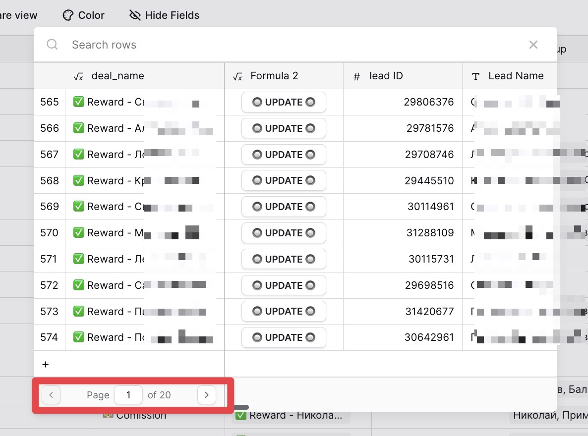
When selecting an item in the ‘link to table’ field, there are currently displayed only a few at a time, divided into segments of ten per page.
This setup is inconvenient when you need to quickly find an item, especially if it’s the 20th, 30th, or 40th in the list. Although there is a search bar, it works then you need to find 1 item, but it’s not practical when you need to add multiple items at once, as it’s hard to keep in mind data of all of them at the same time.
A more user-friendly approach would be to have all items in a single list that dynamically loads more items as you scroll, similar to the functionality in Airtable.
Screenshot demonstrates a current baserow approach with pages
Hello!
I would also add some suggestions for enhancing the “Link to Table” Field Window:
Enable Multi-Select for Elements: Currently, when linking elements within the “Link to Table” field, it’s quite time-consuming to open the window repeatedly for each individual link. Providing an option to select multiple elements at once would streamline this process.
In the future, then I hope you will implement the ability to set relationship types for this field — one-to-many, many-to-one, and many-to-many. For fields with the limit of a single element it could be set to close the window after 1 element is chosen, and for “many” - set the ability to check multiply elements.
Add Sorting Capability: With a large volume of data, navigating through numerous pages in “link to table window” can be cumbersome.
It would be incredibly helpful to have a sorting feature, to bring the most relevant results to the forefront.
Implement Filtering Options: Similarly, having the ability to manually filter within the search window for each search would simplify the process. I believe there was a topic on filtering before, but I haven’t seen this functionality implemented yet.
We had some doubts regarding these two, as we haven’t seen other tools having these functionalities. However, it wouldn’t do any harm if we add sorting and filtering to the link-to-table row select modal, so we’ve decided to accept them. They are a bit of a low priority, though.
on this topic - my team would love to have the option to change the width of the columns in the pop-up for selecting linked fields, so they can see the entire text of the possible fields to link.
Not sure if this goes hand in hand with the enhancements proposed here, but that would be super useful.
This proposal is perhaps in a similar vein to the one already implemented - about being able to see the entire “title” of the linked field from in the main table. Again, this makes people’s live so much easier and seems like a relatively easy fix.
@olgatrykush Thanks - I really do appreciate this!
It’s the little UI things like this one - that seem to pile up and compound together to negatively impact the overall UX for many people I talk to. Especially if they come from Excel and try to use Baserow as if it was an advanced spreadsheet. I also believe that is what people coming from Airtable feel (also using it in large part as a competitor to Excel). What I’m getting at is that there seems to be a series of relatively minor UI fixes, which would hugely enhance the UX for people trying to use Baserow for spreadsheet-like work with 200+ rows of data. Looks like a “low hanging fruit” (and many of those have already been implemented!).
I’ll probably have more feedback on this topic soon, but I guess it merits a separate post altogether.
Anyways - thanks again for super fast responses and great work of the entire Baserow team!
@olgatrykush
would it be possible to at least make the “name” column wider in the row select modal?
(so that more of the text would be visible?)
That would hopefully not necessitate a complete redesign or much work and certainly would make data entry MUCH faster for people, especially for similar entries. Right now, for ‘near duplicates’ in the row name it is very hard to tell them apart