I see that every page in the application builder has a mobile and tablet view in addition to the desktop view. but for the life of me, I cannot figure out how to change how the page looks based on whether its for mobile or tablet or desktop? How do you control the elements on the page based on the the type of device? I looked at your new templates and they look great on any device, but how the heck is that done? How do you make columns vertical on a mobile, and yet horizontal on a desktop? This is nowhere in your docs at all, from what I can tell.
Yes definitively, at some point it will be possible to change the element visibility depending on the current device.
Hey @ddsgad it’s automatic for now: when you display the site on a screen small enough the columns become vertical. May be later you’ll have the choice but not yet.
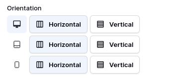
FYI the repeat element and the table element display can be configured depending on the device. Just check their configuration and you should find something that looks like: