Are you using our SaaS platform (Baserow.io) or self-hosting Baserow?
SaaS
What do you need help with?
We have many multiple-choice questions. How can we visualize which answers were selected? For example in a bar chart?
Yesterday I learned that it’s not possible in the Dashboard section (it only aggregates entries), but there might be a way to do it as an application.
Maybe anybody can give me a hint on what steps I need for that?
Hi @r35215742, welcome to the community! I think we discussed this in the webinar right? Glad to see you here on the forum 
Could you share a few details about your database schema so that we could get a general idea how you have set that up in order to provide an as accurate answer as possible?
Yes, I’m the one from the webinar 
Of course! Let me give you more context:
We are building a database that institutions can use to report damage and disasters.
We use a form where an institution enters all possible information. For example: One of the first questions is a multiple-choice question about what kind of damage has occurred. People can choose from the following options.
- Theft
- Fire
- Flood
- Earthquake
and many more.
I would like to build a dashboard that allows us to see in a graph how many cases of theft, fire, etc. there are, esp. in relation to the others (a bar chart for example).
We have many more multiple-choice questions of this type that I would like to display as similar graphs.
@cwinhall does the answer help you for more information?
As the dashboard only let me aggregate answers and the application builder doesn’t seem to have any chart options, I’m a little bit stuck on how to tackle this.
Sorryy for the delay in getting back to you on this, it fell off my radar.
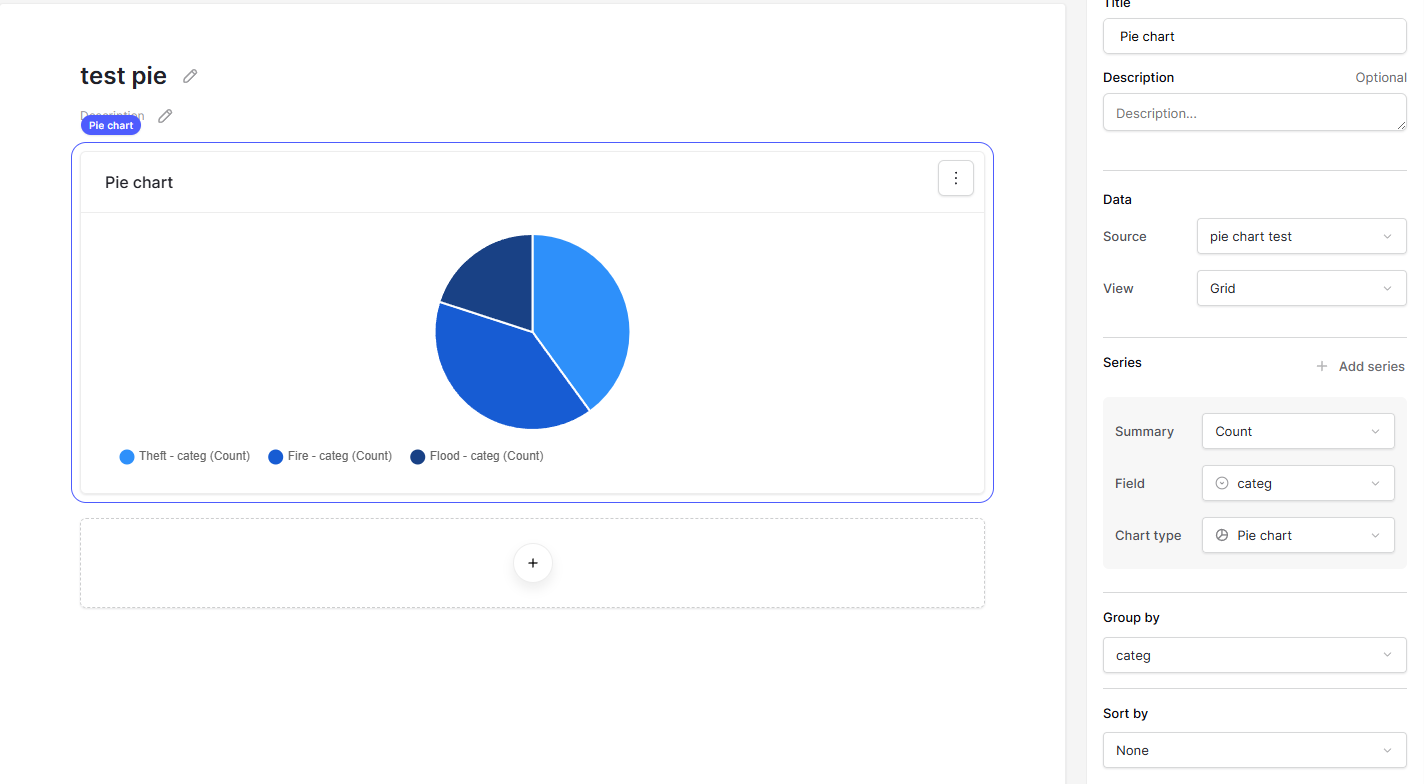
This sounds like it should be possible already using the pie chart widget in a dashboard.
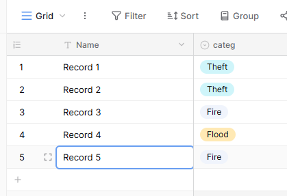
Assuming the table below:
You could create a dashboard widget using the following settings:
Or perhaps I am missing something in how your database and tables are set up?
Thank you very much for the answer @cwinhall and no problem. It comes close to what I want. With our single choice answers, it totally works.
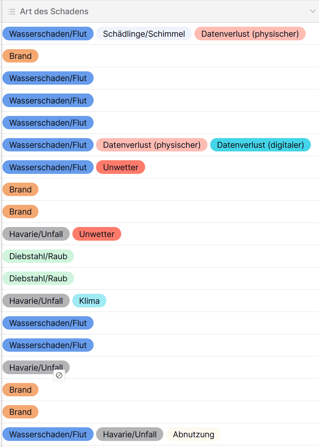
The only thing is I can’t really do this with multiple choice selections, can I? I have some where multiple answers are possible.
Is there an option for that, which I’m missing? Or do we have to structure our data differently?
Hmm, I cannot think of a way to do this but I’ll ask around internally. Perhaps there is still a way.
This is possible in the app builder using an iframe and some custom javascript code but I think it would be great to try and solve this within the dashboarding feature.
Thank you!!
I think it should be as straightforward as the chart with single choice answers … maybe it’s just a simple connection that’s missing or something like that. I hope it is possible.