🌟 Simplifying Navigation: A Proposal for Baserow's UI Enhancement

:wave: Hi, Baserow community and Baserow team!

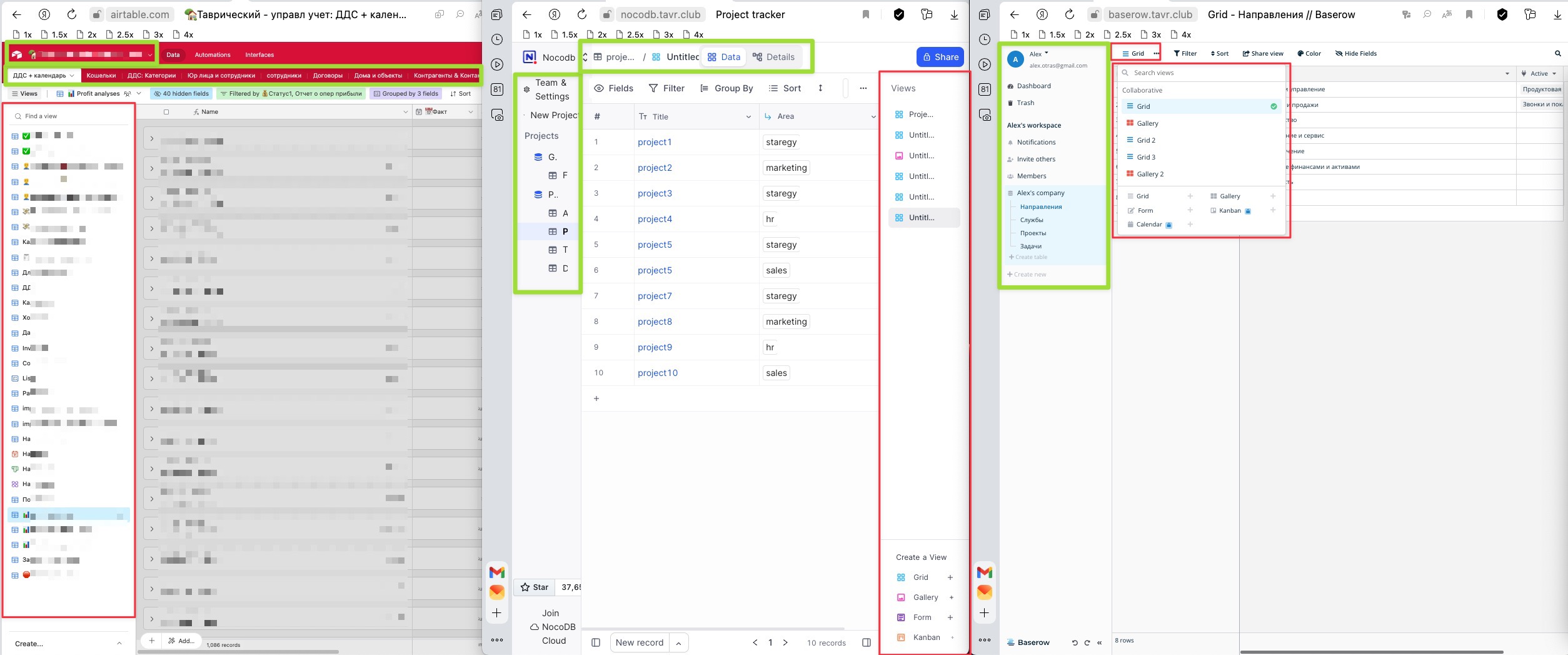
Me and my team are avid users of Airtable, and one of the primary features we heavily rely on is the “views” functionality. We actively maintain approximately 30 views for a main table (and the number continues to increase :chart_with_upwards_trend:). This is one of the key distinctions between the user interface of Google Sheets and the user interface of database systems like Airtable.

What we find incredibly valuable in Airtable is the convenient placement of all these views on the left-hand side of the table. Moreover, Airtable thoughtfully provides sections to help us organize these views effectively :jigsaw:.

In our daily workflow, we seldom switch between tables and workspaces. Therefore, considering the frequency of use, Airtable’s interface serves us the most effectively :clock3:.

In contrast, when we explore nocoDB, we notice that views are placed on the right side of the screen. This approach is a bit less efficient as it consumes valuable screen space, given that both tables and views vie for space :tv:. But at least they are visible, and you can quickly switch between them

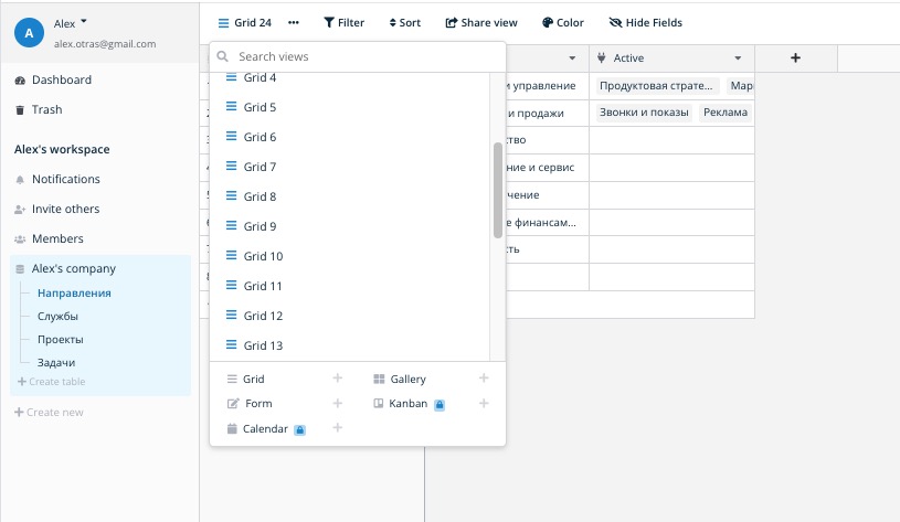
Baserow, on the other hand, boasts a much-improved interface design compared to nocoDB and is closer in functionality to Airtable. :disappointed: However, it employs a pop-up button in the top left corner to house the views. What we find not convenient.

This design choice has its drawbacks, as during our work, we often require immediate access to all views and the ability to switch between them seamlessly :arrows_counterclockwise:.

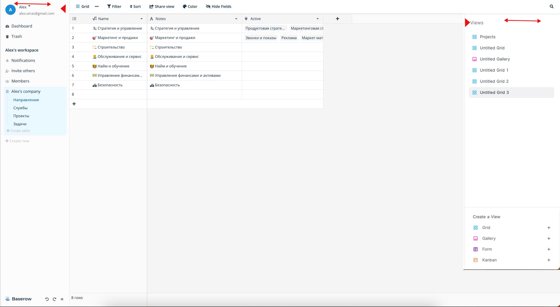
It would be ideal if the user interface in this regard were more akin to Airtable’s design - a left-hand sidebar for views, with tables and workspaces positioned at the top.
Or Even better, it would be fantastic if this sidebar could not only adjust its width but also have the ability to be both sticky and hidden when needed. :round_pushpin::eyes: It will give even more space to work with data.

:star2: This change would offer two significant benefits.

  • Firstly, it aligns with the workflow we guess is more common for the most of the users, enhancing overall usability.
  • Secondly, it would make transitioning from Airtable to Baserow a smoother experience for Airtable users.

I’ve included a screenshot displaying all three interfaces to illustrate the issue. :camera::point_down:

2 Likes

Furthermore, I attempted to create more views, and to access them, I had to scroll down. Considering the sequence of elements, starting with views, followed by tables, and then workspaces, it becomes evident that Airtable’s UI offers superior efficiency and utility.

1 Like

Hello @Alexander, thanks for sharing your feedback. :raised_hands:

We agree that having a view selection at a glance, like Airtable, would be convenient. However, implementing this would require a complete navigation overhaul of Baserow, which may not be feasible in the near future given all the plans we already have on the roadmap.

Do you have any suggestions for UX improvements or features that could help you manage large amounts of views more easily, without requiring a redesign of our current view navigation system?

We have already received requests for the following:

This issue relates to a similar request: Make (published) views visible in sidebar (#762) · Issues · Baserow / baserow · GitLab.

1 Like

Sure! the most simple way I guess could be the decision that NocoDB has made. It is quite organic to just create another sidebar on the right for quick access. In it, you can add sections/folders for views, and it will be super cool. Views can be divided by users, or by other logic.

But it’s important to consider that since users need lot of horizontal space to work with data, it’s important to maximize horizontal space. Currently, for example, in Baserow, there is no way to narrow the left bar; its width is static.

It’s necessary to make it possible to both narrow and hide both the left and right bars, thereby freeing up horizontal screen space. It will become much more convenient to work, and the problem I mentioned earlier will be effectively solved, just in a slightly different way than in Airtable.

As a reference, the way to narrow or hide the sidebar is perfectly implemented in Notion.
CleanShot 2023-09-07 at 09.35.35

1 Like

This is definitely valuable feedback. Just out of my own curiosity could you share a bit about what that workflow looks like (say even on imaginary example) where you need to switch between views so frequently?

One very small thing that could help here is having a shortcut to quickly open the views menu + expand the list to the whole page space that could postpone the time one needs to scroll in the list of views. What do you think about that?

Sure, I will try to give an example bit later :ok_hand:

Let me provide a personal example of managing long-term rental properties in airtable.

To implement this system, we’ve created several tables: cashflow, invoices, payment categories, contacts, contracts, and properties. All of these tables are linked to the cashflow table.

Almost all of the work of employees in the Database is conducted within the cashflow table, which contains around 50 fields.
To address specific tasks, were created separate views with their own sets of fields, sorting, filtering and group by.

For instance, one of the employees has a series of tasks to accomplish throughout the day, switching between different views within the cashflow table:

  1. Reminding clients with overdue payments - view with filters where payments are grouped by payment status.
  2. Recording rental payments received from tenants - using a view with filters where payments are grouped by contracts, making it easier to find the relevant information without having to pre-fill certain fields.
  3. Recording payments received for other services provided to tenants - using a view with filters where payments are filtered by the specific service and grouped by client.
  4. Logging tenant payments for electricity - using a view with filters specifically for electricity payments.
  5. Generating invoices for accountant’s payments - another dedicated view.
  6. Checking the payment status of company expenses - a view with outgoing payments grouped by payment status.
  7. Checking that the payment schedule for a new contract is correctly entered - a view where payments are initially grouped by contact and then by contract.
  8. And few others for different tasks

Hello @Alexander, thank you once again for sharing your feedback on Baserow’s UI. We have discussed it with the team and have an idea of introducing a button that would allow the display of views in the sidebar if needed. Using the same button, you can also return views to the top left of the table. What do you think about this idea?

I’ve also described this in this issue: Introduce the option to display views in the sidebar (#2072) · Issues · Baserow / baserow · GitLab.

1 Like

Hi! I think that it would be a nice and quick solution :+1:

Hi!

I’ve come up with one more idea on how the interface in this case could be improved, drawing from my Airtable experience, where I usually manage a project with 1 database, 5-10 tables, and a total of 30-50 views, including about 30 views in the most frequently used table.

If you implement a dropdown list of views under the tables, divided into folders, it would be intuitive for users. Especially since folders can help logically separate views to prevent clutter. For instance, my 30 views could easily be divided into 5 folders, with 3-7 views each, which would not create a mess on the screen (such as folders for Manager, Reports, Analyses, Registering Incomes, Registering Outcomes, etc.).

Would be useful to be able to drag and drop views between folder. Probably Favorite views can be realized as a folder with a star at the top of the list.

To prevent the left sidebar from becoming overwhelming, options for creating and editing views could be probably maintained in a popup window, as they take up considerable screen space.

It would also be a good idea to make the left sidebar’s width adjustable, and enable full view titles to display upon mouse hover, aiding in quick identification.

Hey @Alexander, introducing a way to structure views is already in our plans: Sections for views/tables (#1017) · Issues · Baserow / baserow · GitLab.

I didn’t get it from the description there.
So are there plans to combine tables and views together in a left side bar like a mentioned above?

Yes, this request was accepted: Introduce the option to display views as fixed sidebar instead of floating context. (#2072) · Issues · Baserow / baserow · GitLab