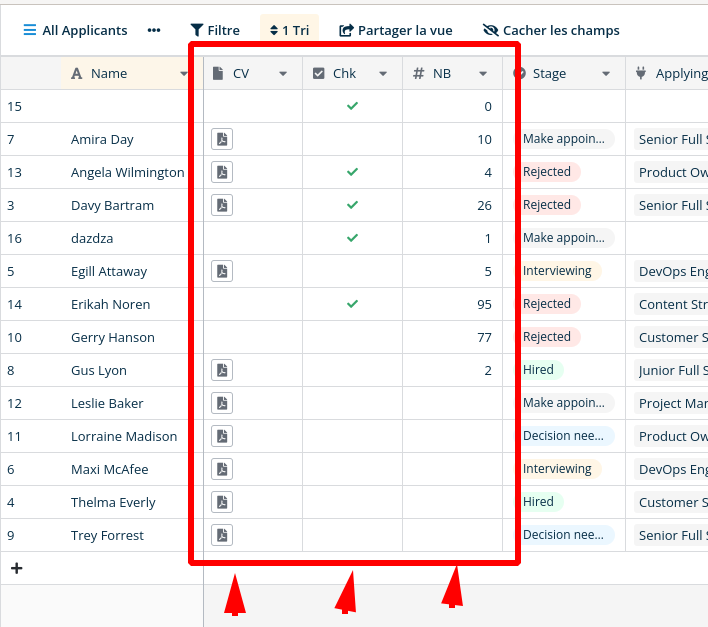
Sometimes the columns contain very little data: a checkbox, a number, a file link. But the column width cannot be reduced according to the actual width of the data contained in the column, as in this example:
Just my thoughts. But then you would loose your header text etc. I think this is a minimum width of a column. You have the icon of the column type, the column name and the dropdown widget to edit the column. You can see when you move your mousepointer from the left towards the triangle of the dropdown widget that the triangle changes color when you are a number of pixels away from the widget.
Maybe that margin could be made smaller. Or maybe we could get the option not to display the icon of the column type. This way columns could be less wide.
Another idea to make it less wide would be if for instance the dropdown menu becomes available when you press the right mouse button. So you wouldn’t need the widget in the column header.
Hey, @Vincent I got your point, and thank you @Peter for sharing your thoughts/ideas on this. Let me discuss with the team what we can do in this case, I’ll get back to you with the update later this week.
Hello @Vincent! We know it’s a bit frustrating when you cannot organize the view of the table as you want. Specifically, to shorten the column width to see more data at once. We understand all this and we definitely plan to add a solution, but not in the nearest future. And you can always contribute this or any other feature to Baserow if you are a developer
Thanks @olgatrykush for your answer, it’s interesting to know what we can expect and what we cant (in the short or medium term). And unfortunately, we do not have development resources we can invest in baserow
Hello @Vincent! We want to be honest and not promise things that we don’t have the capabilities/time for (in the nearest future). We heard you and one day I’ll be happy to get back to this thread and show you the solution to shorten the row width