Hi,
here’s my tip for a developers team to make the user interface better:
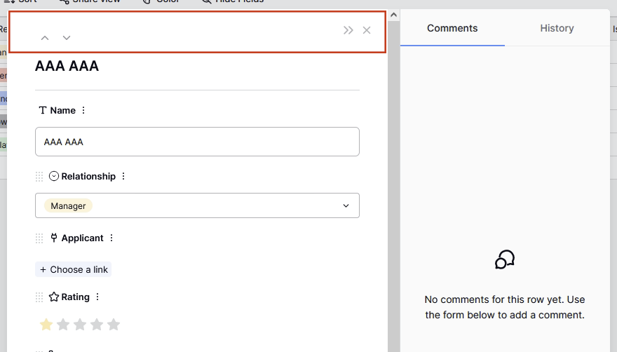
if I open the row window (focus, enlarge the window or whatever you call it), it would be useful to have the header with all buttons (arrows, cross etc.) anchored, the same way how the Comments/History section is. When I scroll down, all buttons are gone, so I always have to scroll up to be able to move to the next/previous row, hide/show the Comments/History section etc.
Great idea @marcus, I’ve added it to the list of discussions. ![]()
I have one additional tip for this:
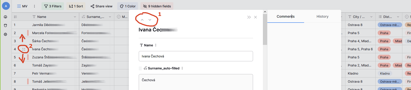
please implement highlighting the current selected row, f.e. by a small icon already used in a grid view (see my screenshot, it’s marked with number 2) - that would be enough - related to that one selected in full view pop-up window.
Also, grid underneath shouldn’t be freezed - if I will advance (list by arrows in the full view pop-up window) f.e. to the row 36, the grid should scroll to it continually.
Right now there is nothing like that and the grid is freezed if the full view pop-up window is displayed.
Hello @marcus,
The request to have a header in the enlarged row anchored will be implemented soon. This is part of the ongoing app redesign that we are working on. ![]()
Great suggestion, we’ll work on it: Highlight the row that is enlarged (#2239) · Issues · Baserow / baserow · GitLab.
We cannot implement this request, as it would cause conflicts with the keyboard shortcuts that are enabled when the row edit modal is open.